Showing posts with label ylim=. Show all posts

Wednesday, October 26, 2011

Plotting mathematical functions with curve


Simple mathematical functions can be plotted quickly with curve() to show their shape. Multiple curves can be overlain by including "add = TRUE" in the call to subsequent curves.


Example 1:
#Negative exponential, a common survival function
curve(exp(-0.5*x),xlim = c(0,10) , ylim = c(0,2), col = 4, lwd = 6, lty = 4)

#Ricker model, use in fisheries modeling
curve(2*x*exp(-0.5*x), add = TRUE, col = 2, lwd = 5, lty = 3)

#A legend with the appropriate colors, line types. "cex" increases the font size.
legend("topright", c("Neg exponential", "Ricker"), lty=c(4,3),col=c(4,2), bty="n", lwd = 5, cex =2)


Example 2:
#The logistic function
curve( exp(1*+ 1*x) / ( 1 + exp(1 + 1*x) ), xlim = c(-10,10) , ylim = c(0,2))

#Overlaying a Gompertz function
curve(1*exp(-1*exp(-2*x)), add = TRUE)

Tuesday, March 1, 2011

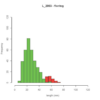
Overlaying two histograms with "add=TRUE"


#Two histograms can be overlain by putting the command "add = TRUE" in the call for the second histogram.

#Make sure that the height of the y-axis can accommodate both sets of data - the y axis appears to be set by the first hist() command.

#Colors for the two graphs can be set using col="red"

par(mfrow=c(1,1)) #this tells R to graph 1 plot at a time

#The first histogram. xlim= and ylim= set the axes, and main= and xlab= the labels
hist( subset(practice_S$L_2003, practice_S$s_2003=="Y"), col="red",xlim=c(0,125), ylim = c(0, 125), xlab="length (mm)", main="L_2003 - flwring")

#The second histogram, with the "add=TRUE" commend
hist( subset(practice_S$L_2003, practice_S$s_2003=="N"), col="green",add=TRUE ,xlim=c(0,125), xlab="length (mm)", main="L_2003 - non-flwring")

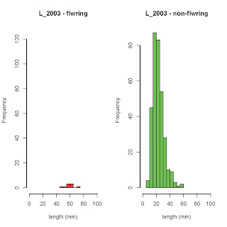
#One problem with this approach is bars that occur directly on top of each other get obscured. An alternative is to plot each set of data as a density function, or to just plot them side by side.


#If I wanted to plot these histograms like this, I could change the par() statement to (1,2) and remove the "add=TRUE" statement in the second histogram

par(mfrow=c(1,2))

#The first histogram
hist( subset(practice_S$L_2003, practice_S$s_2003=="Y"), col="red",xlim=c(0,100), ylim = c(0, 125), xlab="length (mm)", main="L_2003 - flwring")

#The second histogram,
hist( subset(practice_S$L_2003, practice_S$s_2003=="N"), col="green",xlim=c(0,100), xlab="length (mm)", main="L_2003 - non-flwring")

Tuesday, February 22, 2011

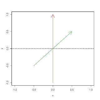
Plotting vectors using segments()


#A classmate needed to plot some vectors for a power point presentation. Here's some basic #code for plotting lines in R:


#First, tell R you want to make a plot. I'll make two objects that just contain zeros and tell R to #plot them, which is just a quick way to get the plotting process started.

x<-0 y<-0 plot(x,y, type="l", xlim=c(-1,1), ylim=c(-1,1))


#type="l" tells it to plot x and y as a line - since its just the point (0,0) you get nothing.
#xlim=c() and ylim=c() sets the axes

#You can plot lines using segments()


segments(x0=0, y0=0, x1=0, y1=-1, col=2)
segments(x0=0, y0=0, x1=-0.5, y1=-0.5, col=3)


#col=2 gives you read, while col=3 is green


#You can plot arrows with arrows()

arrows(x0=0, y0=0, x1=0, y1=1, col=2) arrows(x0=0, y0=0, x1=0.5, y1=0.5, col=3)

#A quick way to plot lines is abline(). This is often used to plot lines on graphs of statistical #models. (0,0) tells abline to plot a line at with a y intercept of zer and a slope of 0. (1,1) would #make a 45 degree line.

abline(0,0, lty="dashed")


#lty= means "line type"

#for more info on adjusting graphs, lines, and axes, see


help(plot.default)

#and

help(par)