Showing posts with label hist(). Show all posts

Thursday, October 20, 2011

Making basic plots with qplot( ) in the ggplot2 package


The package qqplot2 offers a lot of improvements over the basic plot() function in R. The basic syntax is luckily not that different than plot().

A qplot statement looks like this:

qplot(xaxis, yaxis, data = dataframe, geom = "point", color = category, xlab = "label", ylab = "label", main = "title")

So, a plot statement could look like

qplot(mass, offspring, data = reproduction, geom = "point", color = plot)

geom can take on several things:
geom = "line"
geom = c("point", "smooth") => a scatter plot with a smoothing spline
geom ="histogram" => standard histogram
geom = "density" => a smooth distribution curve instead of a histogram

Graphs with multiple panels are created by including "facets = "

Saturday, March 5, 2011

ploting bar graphs with plot()


Its easy to make histograms with hist() to show you the distribution of a set of data.

For actual bar plot, such as you would make in excel, there's also a function called barplot(). I think you have more control, however, you you use the regular function plot() with a few modifications.

I work with a population of plants that often go dormant. I had a proportion table like the output below for 8 years of data. Some plants were around all 8 years, but many went dormant for 1 or more years.

I made the proportion table using table() and prop.table(); round() gets rid of the excess decimal places.
> round(prop.table(table(factor(S_tot_yrs_pres_03_10))),3)

The table output is like this:
0 1 2 3 4 5 6 7 8
0.009 0.120 0.098 0.079 0.110 0.144 0.180 0.140 0.120

This give me the portion of plants that grew a certain number of years. I grabbed this data and the plotted it as a bar graph ("column" graph in Excel parlance) using plot() with a few extra calls.

The code was this:
plot(years_above_ground, portion_of_pop, type="h", lwd=50, lend=2, col=2, ylim=c(0,.25), xlab="years of growth", ylab="portion of pop")

The key to making this look like a bar graph are these three pieces
type="h", #This tell it to make a graph of type "histogram"
lwd=50, #This tell the line width to be 50; otherwise it will plot skinny lines.
lend=2, #this makes the line end style to be flat; the default is rounded.

Tuesday, March 1, 2011

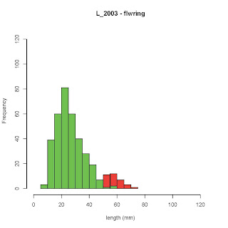
Overlaying two histograms with "add=TRUE"


#Two histograms can be overlain by putting the command "add = TRUE" in the call for the second histogram.

#Make sure that the height of the y-axis can accommodate both sets of data - the y axis appears to be set by the first hist() command.

#Colors for the two graphs can be set using col="red"

par(mfrow=c(1,1)) #this tells R to graph 1 plot at a time

#The first histogram. xlim= and ylim= set the axes, and main= and xlab= the labels
hist( subset(practice_S$L_2003, practice_S$s_2003=="Y"), col="red",xlim=c(0,125), ylim = c(0, 125), xlab="length (mm)", main="L_2003 - flwring")

#The second histogram, with the "add=TRUE" commend
hist( subset(practice_S$L_2003, practice_S$s_2003=="N"), col="green",add=TRUE ,xlim=c(0,125), xlab="length (mm)", main="L_2003 - non-flwring")

#One problem with this approach is bars that occur directly on top of each other get obscured. An alternative is to plot each set of data as a density function, or to just plot them side by side.
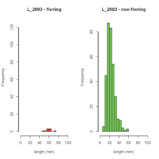


#If I wanted to plot these histograms like this, I could change the par() statement to (1,2) and remove the "add=TRUE" statement in the second histogram

par(mfrow=c(1,2))

#The first histogram
hist( subset(practice_S$L_2003, practice_S$s_2003=="Y"), col="red",xlim=c(0,100), ylim = c(0, 125), xlab="length (mm)", main="L_2003 - flwring")

#The second histogram,
hist( subset(practice_S$L_2003, practice_S$s_2003=="N"), col="green",xlim=c(0,100), xlab="length (mm)", main="L_2003 - non-flwring")